
The other day, while I was at the studio, going through some drawers, I came across a stack of old business cards that I saved. I was super excited about this since, the cards were created over the course of about five years and document the slow growth of Cosmos Creative as an entity and my personal development as an artist. So today, I thought I would share a bit about the history of their making...
The first card I made, was the yellow one; it features the Pinball pattern from the Cosmos Creative Collection. The pattern has since been, licensed to Pinball Publishing for use on note cards. However, this card was created around 2005, which was well before I licensed anything…I was making handmade books at the time, and just started to really get interested in patterns. I was sharing a studio with some very talented friends of mine, whom are best known as, Ghost-Town Design and lucky for me, they let me use their silk-screening materials and taught me quite a bit about the craft.
Second after the yellow card, came the turquoise card that features a drawing I did around 2004 called, Bridgescape Water. I remember distinctly that Darren, from Ghost-Town, helped me print this drawing. Thanks to him, it came out fantastic and the line quality was preserved. I even managed to make a few art prints from this; most of which I gave away to friends and family, so it goes ;}

After the turquoise card, came the orange card, showcasing the Circuit pattern from the Cosmos Creative Collection. This one, I did everything myself, which is probably why very few of these cards were ever made. I messed up a lot of what I printed. On a large portion of the cards, the pattern bled and well, didn’t look that pretty. Out of the batch though, I did manage to salvage a few and distribute them when and where necessary.
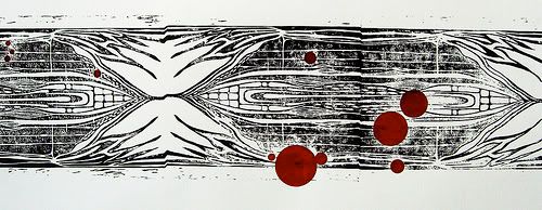
Next up, came the black and white card that I block printed on Bristol. I carved the block out of linoleum. It features a drawing I did sometime around 2004 called, Underground. That I later used in a piece titled, Underground Red. It was quite a tedious block to carve and even more so to print. But even still, whenever I feel necessary, I still incorporate this block into my work today.
After the linoleum print, I got lazy and just decided to spray some Sumi ink on paper, slice it up and call it a business card. Fortunately, it worked with the whole company identity that I was developing at the time and actually, I still use this sometimes for my cards when I need them in a hurry.
And last but not least, is the pink card, which features the Two of Hearts pattern from the Cosmos Creative Collection. I just recently made these in a rush, which is why I abandoned all creative processes, and went with laser printing instead. I know, such a shame, but sometimes, it’s a necessary evil. This was also the first time that I incorporated the COSMOS logo, instead of just the suggestive red star. Like I mentioned, these cards were done in a hurry and I didn’t have the time to hand stamp every card, as I had done before. Nonetheless, I actually like the way they came out. Dare I say, they definitely help to achieve a cohesive brand identity, which is easily recognizable, and therefore not necessarily a bad thing!
Anyway, hope you’ve enjoyed this brief history session. I certainly would love some feedback on what card you like most and whether, or not, you like the use of the logo, or just the red star...so leave me a comment and let me know! Hearts!
2 comments:
I suppose I just like "old things" but the white card with the single star and the stains is really lovely. It feels like love, if that makes any damn sense.
Hand stamping those cards is a labor of love, so it certainly does make sense ;} Thanks for the feedback Adoniram!
Post a Comment